
Xplosion iOS app Redesign
We refined the data visualization using user interviews, SME interviews, and domain research. I also worked with the Internet of Things to create better user interaction designs. For example, I sketched all the screens initially and later wire-framed the Create Team and Add Player flows.

Research
Initial Research Summary
Meeting with the CEO and Xplosion COO gave us their product vision. The goal of this project would be to present the tracked data in user-friendly ways to coaches.
Because coaches have the most influence on players’ daily practice habits, so Xplosion wanted to target coaches as the user group.
Domain research verified that targeting coaches would give Xplosion a competitive edge. I also used competitive analysis to see how other companies display their data points.
I did a content inventory of the Xplosion app to understand the information metrics we're working with. Then, to better display the data, I did a competitive analysis to determine how other app report data metrics. Finally, I compared this information to the content inventory for Xplosion. The results gave us a clearer idea of the industry standard for data metrics.

Data Visualization Expert Interview
Data Visualization expert, Craig Fryar from Tableau, met with us to go over best practices for displaying data visualization on Mobile.
Takeaways:
Only show one metric graph per screen. But, on Mobile, it becomes overwhelming to do more than that.
Discovered the essentials metrics for coaches
Don't use more than three visualization charts at a time
Through our meeting with Craig, I could add questions to the user interviews I wouldn’t have considered. These new questions focused on which metrics were most important to coaches and provided valuable information later in the design process.

User Interviews
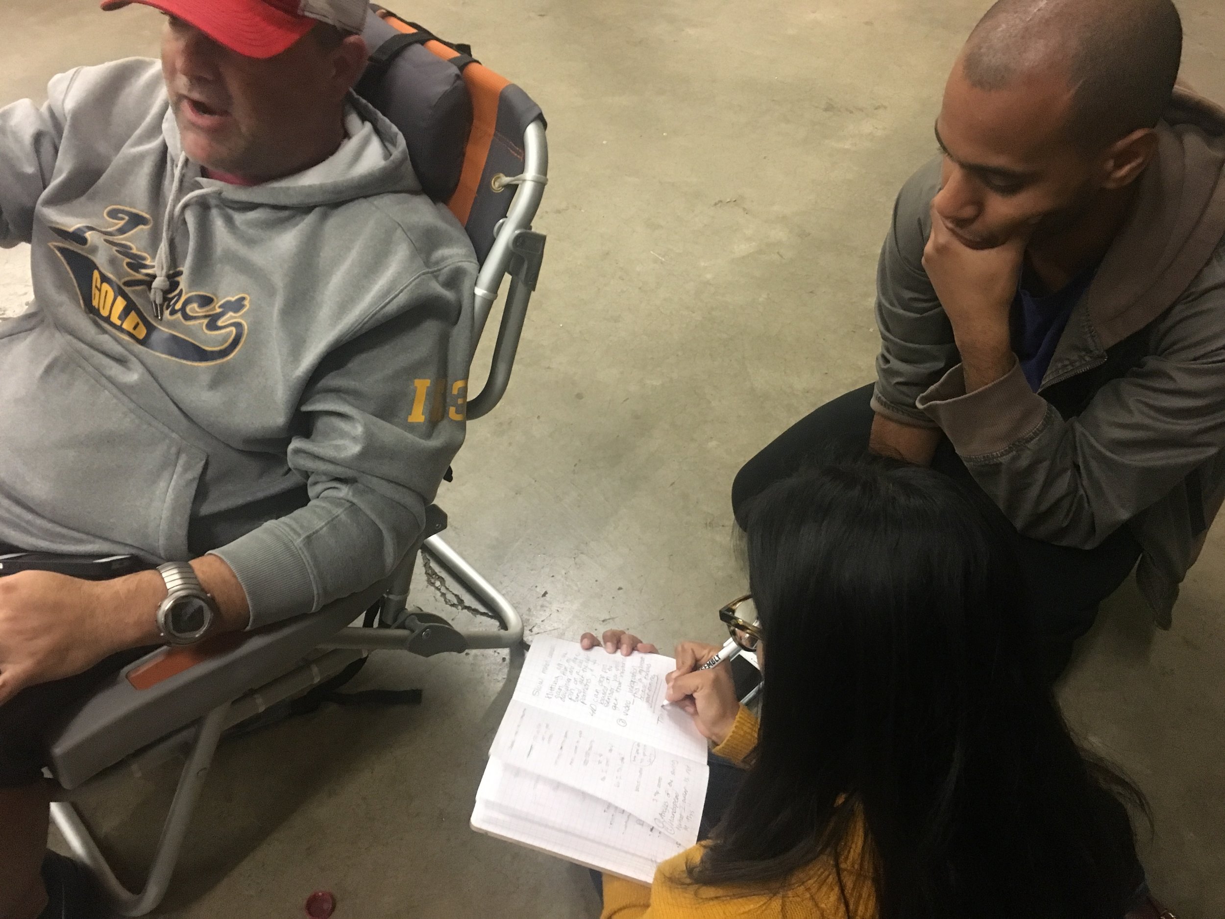
By visiting batting cages and training facilities across the Austin metro area for user interviews, we were able to reach our target user group.
The coaches ranged from t-ball to college level. These seven interviews gave us examples of the best methods they use while coaching.
It became apparent that if I could display the data with more context and clarity, it would be a sticker.
User interview summary

Usability Testing current iOS app
Positive Findings:
The app is an impartial communication tool for players
Viewing individual players beside their peers
The ability to record more than one body metric
Coaches Had Issues with:
Navigation and that the data was difficult to read
Confused by unit signifiers as no unit of measure was given
Weren't using the feedback mechanism of good/bad
Data on the team dashboard overwhelmed them.
Felt like a leader-board was counter-productive
I needed to narrow down the information that coaches saw at a glance and provide better navigation. But still, let them adjust the data between players. I decided to look for ways to offer more user freedom.

Player Dashboard Before Redesign

Planning
Personas
The professional and the parent coach have different wants, goals, and pain points that change their interaction with the app. So I showcased those in the personas.
There are also two different coaching styles that either persona might use: the data-driven coach and the hands-on coach.
Data-driven coaches want to show facts to players giving a stable baseline for change. Hands-on coaches want to show players how to improve based on their communication needs.
Both coaching styles firmly believe that each player is different, and their goal is to bring each player to their own "ah-ha moment."
Personas are based on the information gather in user interview and online research about coaches.
Sitemap
I created a sitemap of the existing iOS app as part of the research. I found a lot of screens that could combine for better accessibility of the app.
The primary function of the app, connecting the sensor, was hidden within a submenu. Also, the iconography was not clearly labeled, making it even harder for users to connect the sensors.
Navigation is more transparent allowing the user direct access to the focus point of the app.
Internet of Things
While planning the app, we realized that a more in-depth knowledge of how the sensors and app communicate was needed. We set up a live demo with the client to see how the sensors work with the app.
During the demo, I found that good/bad button, was design because the app needs a way to capture data in segments to measure swings. Currently, a capture button needs to bring each new swings data into the app.
The next phase of development is planned to be a move to streaming data from the sensors to the app as a matter of course. So we got the go ahead to design for streaming and not the current data capture method.


Design
Interaction Patterns and Sketching
I added an option to rank the body metrics coaches wanted to see while creating a team. The team dashboard would display only the select body metric as well. Coaches could select a target range for each player when adding players.
Using the inputs entered by coaches, I, too, created a new format for the team dashboard. Only one metric would be displayed, which would be the last swing. Also, a circle would outline it, showing how close each player was to their target number.
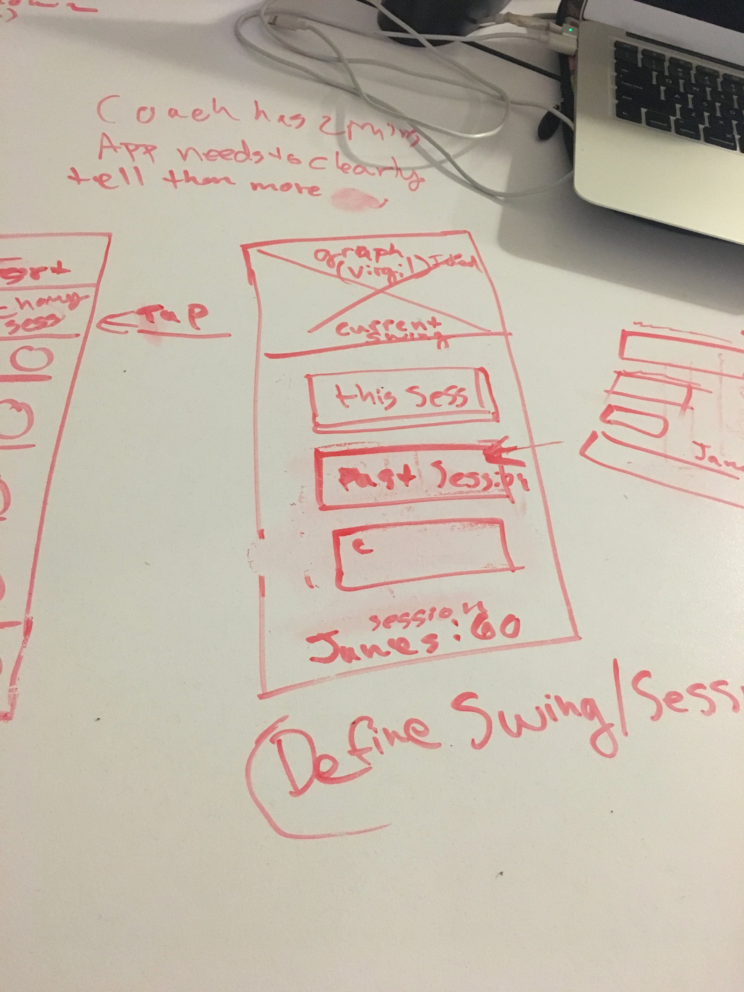
I used a whiteboard to sketch the interaction patterns.
Sketching and Wireframes
Making the “record session” feature the focal point of the navigation bar was necessary to keep the app's primary function quickly accessible.
We decided as a team to keep the connection to sensors options the same and to add the ability to select team members on that screen. Users could then hit the Start Session button to start recording data and Ends the Session with the same button.
Style Tiles
Mixing the color pallets from the current iOS, and Android apps, I brought out elements they wanted, such as Motivation, Movement, Bold, & Energy. It's named Xpotivation.
Klavika Medium Italic Headlines and gradient colors convey a sense of motivation, boldness, and energy. To balance out the bold orange, I used navy purple for the text and violet for the calls to action. Also, for balance, I used Heebo, the list copy.
To provide Xplosion with options for a style guide, I did a style tile workshop with the client.
Final Mock-Ups
These wireframes I did in Sketch.
Testing
Usability testing
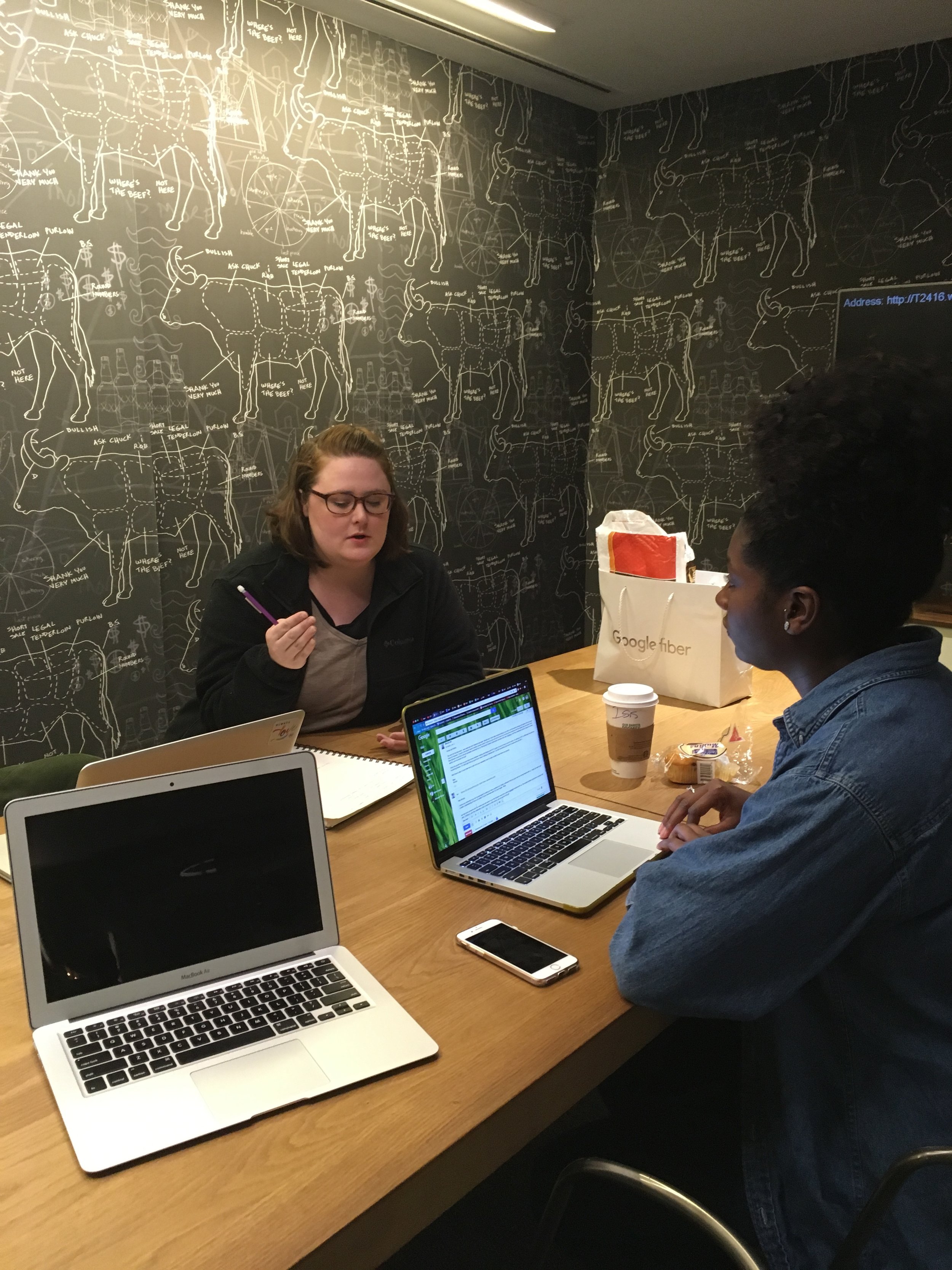
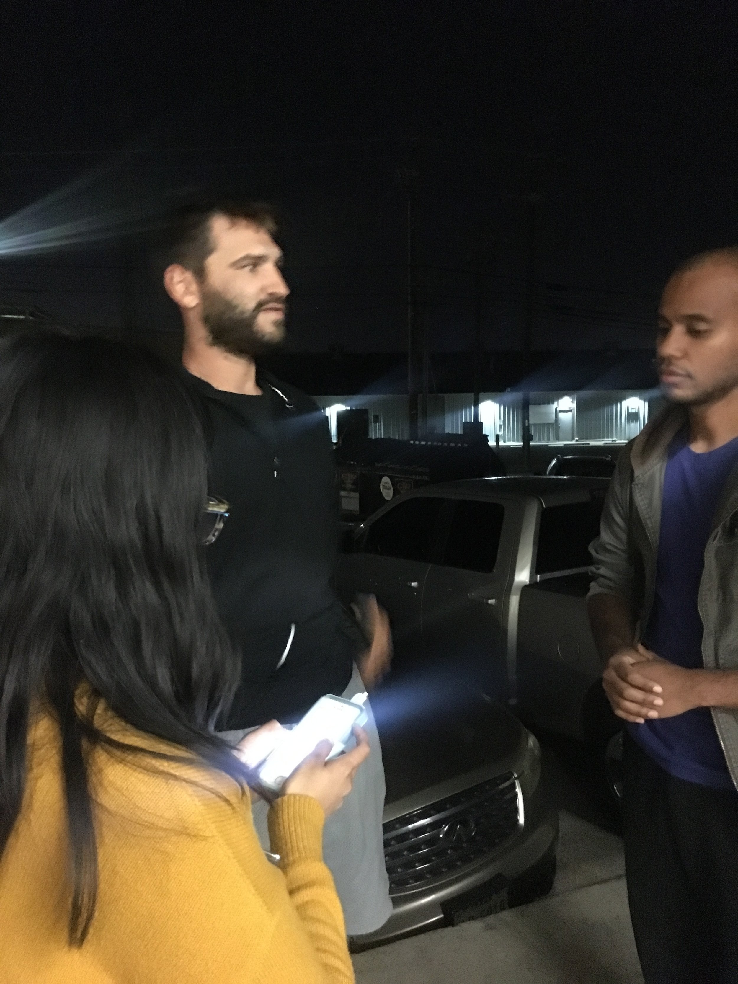
While Usability Testing the new design, we traveled to batting cages from Austin to Georgetown and spoke to six different coaches. Using the InVision app gave coaches a more realistic experience of how the app could be used at practices.
Key Findings:
With the Create Team screen, coaches were confused by selecting a default metric. They kept trying to skip creating a team without choosing a metric.
I wanted to know the players’ positions. (infielder, outfielder, etc.)
Slight confusion over what a session was. Once they clicked on it, though, they had no further issues.
The language of the navigation bar confused them. They wanted to see data for the whole Team under Team and only about individuals under Analytics.

Iterations after testing
The language of the navigation bar was changed to say Players instead of Team and Team Charts instead of Analytics. Better identifying the use of each area.
Because coaches had such significant issues with the Create Team's default metrics, I had to rethink this flow. I removed the default metric and the player's ranges on the Add Player setup. Instead, I add a field to the player's position on that page.
These changes also removed the progress circle around the numbers on the Team Dashboard. A toggle menu at the top of the page allowed me to keep one number on this page at a time.

Wrapping up
Further Change Suggestions
A Control Panel for coaches to change settings for already created teams and players.
A complete walk-through flow for first-time users
More in-depth focus on the individual player data dashboard
A separate player interface so coaches can share data with players
More gamification within the interaction patterns. One place this could happen is the Record Session screen. It could enlarge beyond the navigation bar when pressed. The screen could then swing up from the navigation bar like a bat to fill the screen.